Men fashion colors skin tone is the most overlooked factor in how sharp or tired you look after 30.
Most men blame age or body shape, but the real problem is wearing colors that fight their skin tone.
You can wear a perfectly fitted outfit, but if the color clashes with your skin tone, you’ll look tired, dull, or older than you are. That’s why in Korea right now, men’s fashion is shifting away from trends and toward personal color analysis—matching clothes to your undertone.
And here’s the hard truth: after 30, the wrong colors punish you fast.
Let’s break it down properly.
First: Stop Thinking in “Race.” Think in Skin Tone
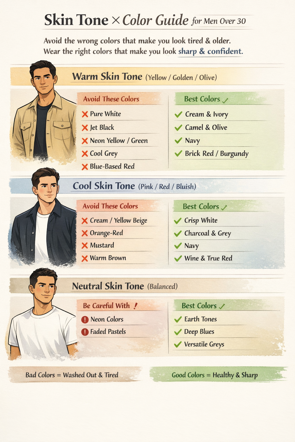
Korean stylists don’t divide men by race. They divide by undertone:
- Warm tone – yellow, golden, olive undertones
- Cool tone – pink, red, bluish undertones
- Neutral tone – balanced mix of both
Indian, East Asian, Middle Eastern, European—doesn’t matter.
Two men from the same country can have completely different undertones.
Ignoring men fashion colors skin tone is why many men look older than they are.
Now let’s talk about the 7 colors men over 30 should stop wearing blindly, and who they actually work for.
Personal color analysis has become mainstream in Korea, as highlighted by Vogue Korea, and while the article focuses on women, the same principles apply to men.
1️⃣ Jet Black (Especially Near the Face)
Black sounds “safe,” but harsh black drains color from your face as you age.
- Bad for: warm tones, olive skin
- Why: exaggerates eye bags, shadows, dullness
Better options:
- Charcoal
- Soft black
- Deep navy
If black makes you look tired instead of sharp, it’s not you—it’s the color.
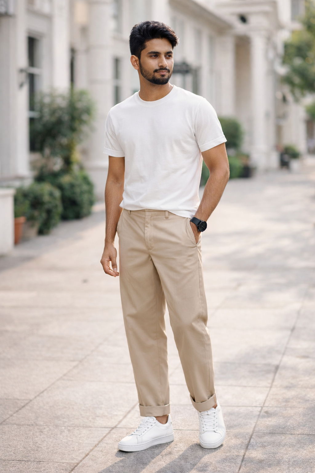
2️⃣ Pure White
Bright white reflects light straight onto your face.
Great in photos. Brutal in real life.
- Bad for: warm and olive tones
- Why: makes skin look yellow or uneven
Better options:
- Off-white
- Ivory
- Cream
Korean stylists almost never use pure white for daily outfits. There’s a reason.
3️⃣ Neon Colors (Just Stop)
Neon green, neon yellow, electric orange—these colors fight your face for attention.
- Bad for: everyone over 30
- Why: looks immature, cheap, and chaotic
These colors don’t say “confident.”
They say “trying too hard.”
4️⃣ Dusty Grey
Grey can be elegant—or lifeless.
- Bad for: cool and pale skin tones
- Why: blends into your face and kills contrast
Better options:
- Warm grey
- Greige
- Taupe
If grey makes you look sick, it’s not minimal—it’s wrong.
5️⃣ Bright Red
Red is powerful, but most men pick the wrong red.
- Bad for: warm tones wearing blue-based red
- Bad for: cool tones wearing orange-based red
Better options:
- Burgundy
- Wine
- Brick red
In Korea, stylists rarely put men in bright red unless it’s carefully balanced.
6️⃣ Pastels (Without Skin Contrast)
Pastel colors look soft and modern—but only if your face can handle them.
- Bad for: deeper skin tones without contrast
- Why: washes you out
Better options:
- Muted versions
- Earth tones
- Rich mid-tones
Pastels aren’t “bad.” Wearing them blindly is.
7️⃣ Trend Colors That Ignore Your Face
This year’s “it color” might look great on Instagram—and awful on you.
Fashion trends don’t know your skin tone. Korean men understand this now. That’s why personal color analysis is exploding there.
If a color looks good on everyone except you, the problem isn’t your body. It’s chemistry.
If you’re building a cleaner wardrobe, read our guide on
Old Money Style for Men.
Quick Skin Tone Test (No Tools Needed)
- Veins look green → Warm tone
- Veins look blue/purple → Cool tone
- Can’t tell → Neutral tone
That’s enough to stop 80% of mistakes.
The Real Upgrade After 30
Mature style isn’t louder.
It’s more selective.
Men who look expensive aren’t chasing trends. They’re wearing colors that make their skin look healthy, rested, and confident.
That’s the difference.
CTA
If this guide helped you, save this post and start checking colors before buying clothes.
Explore more no-nonsense men’s style advice at mensbfh.com.